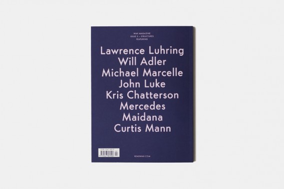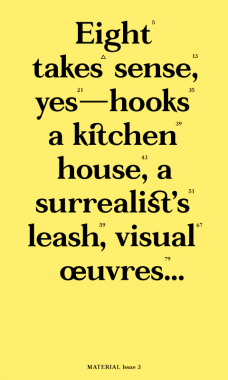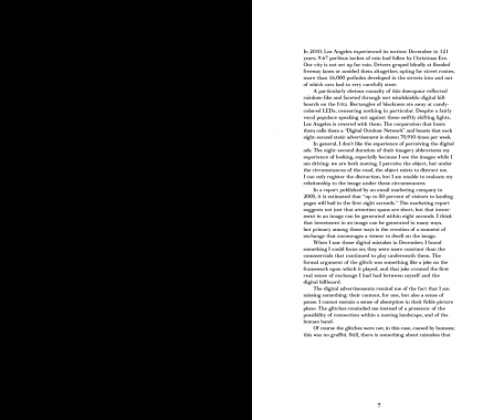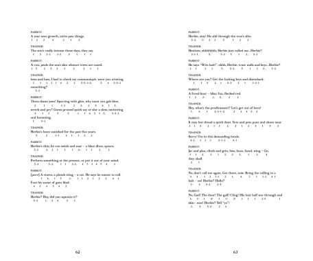
Essays by Jennifer Doyle. Photography by Michael Wells.
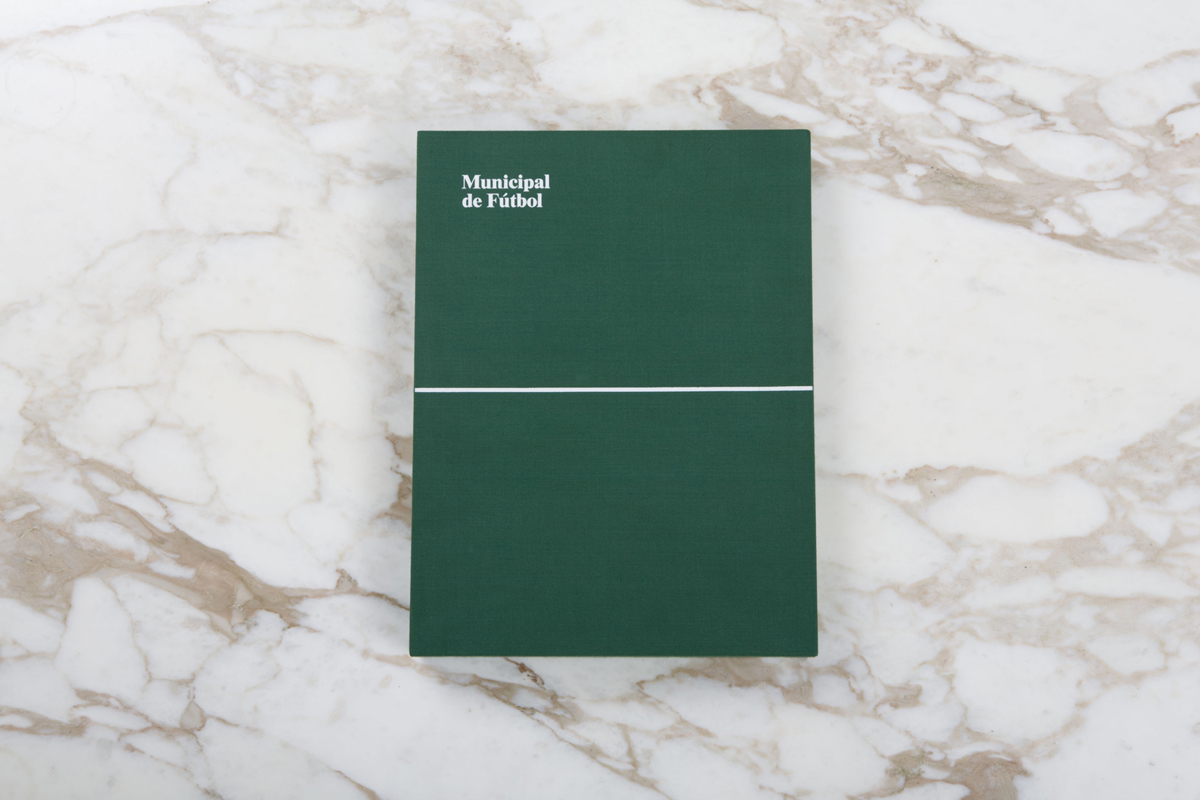
Municipal de Fútbol
Hardcover/boxed, 192 pp., offset 4/1, 260 x 350 x 40 mm
two books, one poster, nine artist lithographs, and a fútbol jersey, in cloth box
English and Spanish
Edition of 1000
ISBN 978-0-9816325-0-6
ISBN 978-0-9816325-1-3
ISBN 978-0-9816325-2-0
Published by Christoph Keller Editions, Textfield
$80.00 $40.00 ·
Distributed in North America by
Distributed Art Publishers
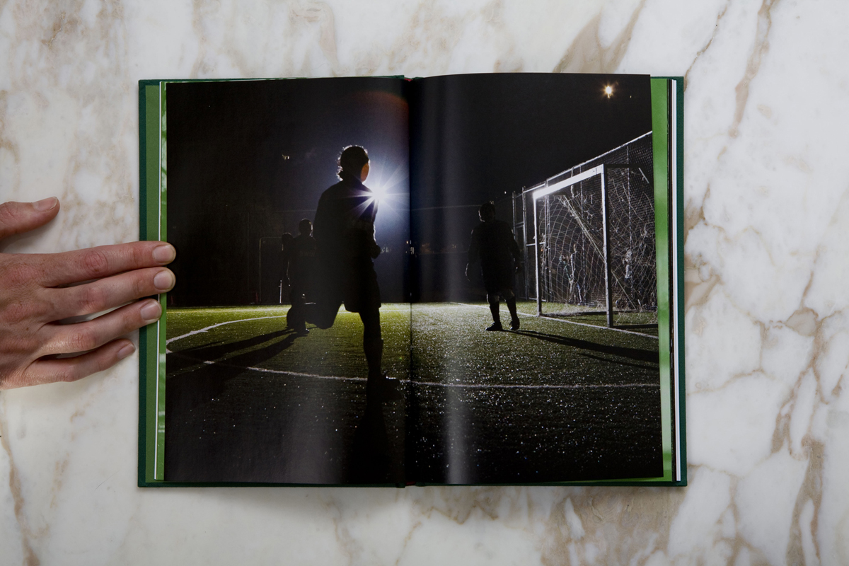
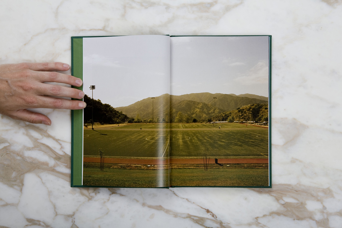
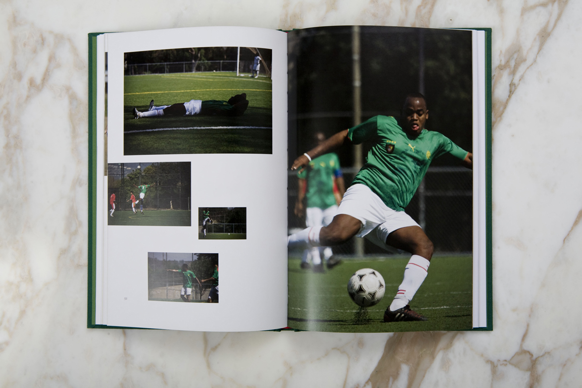
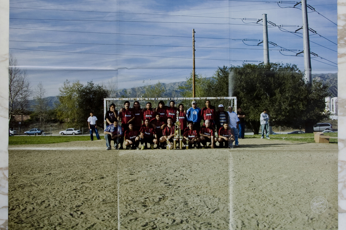
Municipal de Fútbol is a collaborative edition about amateur soccer in Los Angeles—the everyday experience of playing in pick-up games, weekend and night park leagues. Jennifer Doyle, a contributor to frieze and author of Sex Objects: Art and the Dialectics of Desire, has contributed two essays to the books, both with Spanish translation. Housed in an embossed green clothbound box with black ribbon pulls, the edition includes two clothbound books (one of which studies the game as it is played throughout Los Angeles, on hijacked baseball fields, back lots and public squares, and the other of which focuses on one field in particular, the ultra-scrappy and always animated Lafayette Park); one poster; artist lithographs by As-Found, Roderick Buchanan, Mari Eastman, General Idea, Jakob Kolding, Jonathan Monk, Arthur Ou, Peter Piller and Michael Wells; and a European National team adidas fútbol jersey with a “Municipal de Fútbol/Los Angeles Recreation and Parks” embroidered patch and a reflective silk-screened number. The edition is designed by Jonathan Maghen and photography is by Michael Wells.
“Fútbol bubbles up from the ground. It rains down on parks and leaks through walls. It rises like an irrepressible tide, and recedes only when everybody has to go earn some money for themselves and their families. Nobody playing here thinks it’s going to make them rich. Or famoso. It is what happens instead of work.” — Jennifer Doyle


AA Bronson, Art, Arthur Ou, As-Found, Christoph Keller Editions, Criticism, Culture, DAP, Distribution, Fashion, General Idea, Jakob Kolding, Jennifer Doyle, Jonathan Maghen, Jonathan Monk, Mari Eastman, Michael Wells, Peter Piller, Roderick Buchanan, Sandy Yang, Sport, Textfield, Typography

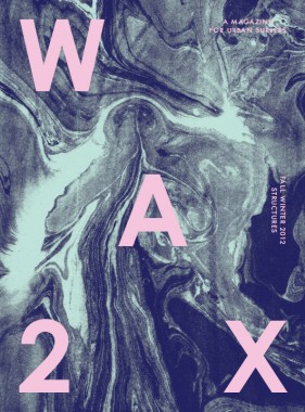
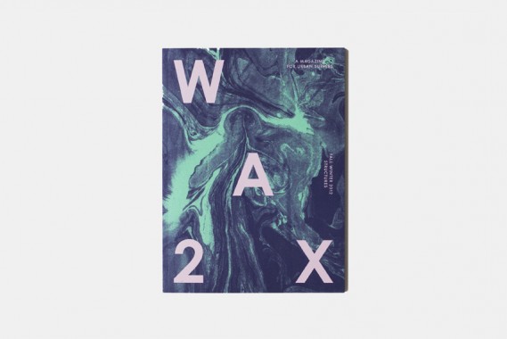
WAX Magazine 2, Structures
Softcover, 128 pp., offset 4/1, 200 x 270 mm
Edition of 500
ISSN 2167-8073
Published by WAX Magazine, Inc.
$15.00 ·
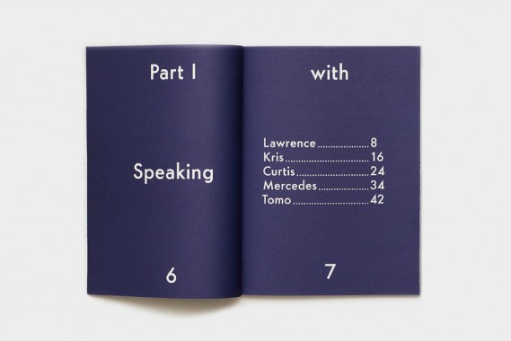
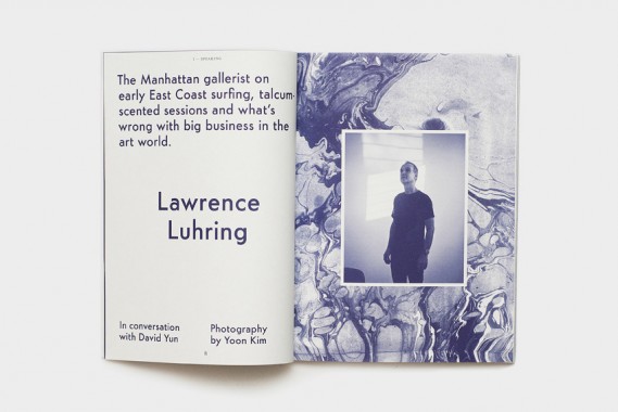
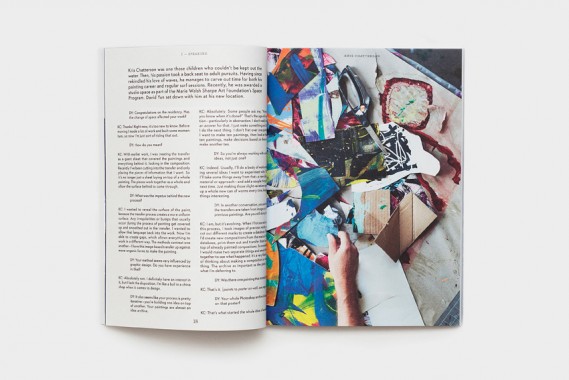
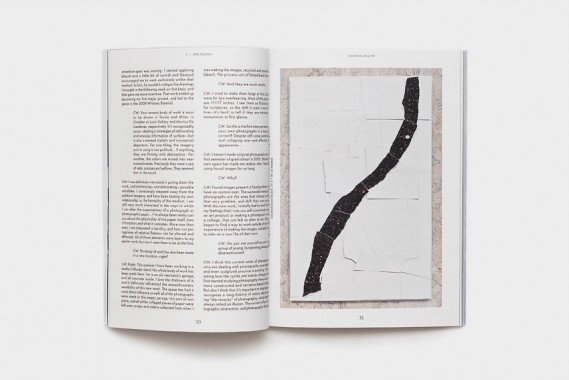
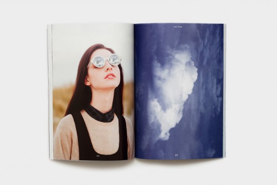
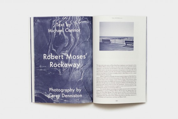
Featuring: Lawrence Luhring, Will Adler, Michael Marcelle, Kris Chatterson, Mercedes Maidana, Curtis Mann, John Luke, Mark Mahaney, and a free friction moment with Derek Hynd.
WAX is a bi-annual print publication exploring the intersection of art, culture and surfing in and around New York City. We believe that beauty and meaning can be found on sidewalks, boardwalks, skyscrapers and beaches alike. We’re interested in exploring the rich history of New York surfing, its beaches and residents and in finding a pathway of cultural creativity on and off the break. WAX shares the stories of area surfers who are also artists, designers, authors and auteurs. Each issue is organized around a unique theme, debuting with WAX Magazine 1, Dialogues in Spring 2012.


Abbye Churchill, Aeriel Brown, Art, Carey Denniston, Carmen Winant, Chris Rypkema, Cian O'Day, Culture, Curtis Mann, David Yun, Derek Hynd, Distribution, Elisa Routa, Jeff Mclane, John Luke, Jonathan Feldman, Kris Chatterson, Kristian Henson, Larissa Kasper, Lauren Snyder, Lawrence Luhring, LK Futura 1.0, Luke Stettner, Mark Mahaney, Matt McGregor-Mento, Mercedes Maidana, Michael Conner, Michael Marcelle, Mike Killion, Murray Fraser, New York, Photography, Rob Kulisek, Sport, Surfing, Tyler Breuer, Typography, WAX Magazine, Will Adler, Yoon Kim, Zak Klauck


Ginny Cook and Kim Schoen, MATERIAL 3
Softcover, 96 pp. + insert, offset 2/1, 160 x 270 mm
Edition of 500
ISBN 978-0-9801441-2-3
Published by MATERIAL Press
$15.00 ·
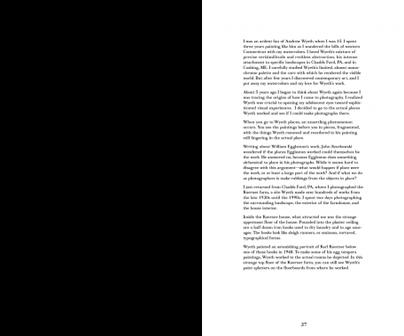
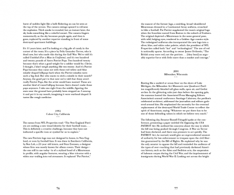
MATERIAL exists as a platform for the artist’s voice. Each issue brings together a different group of artists who write, as well as a new collaboration with a graphic designer. During the production of this third issue, our designer Zak Jensen put forth the idea of concatenation — the act of linking together, or the state of being joined (
It was caused by an improbable concatenation of circumstances) (there was a connection between eating that pickle and having that nightmare)
(the joining of hands around the table).
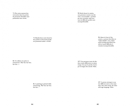
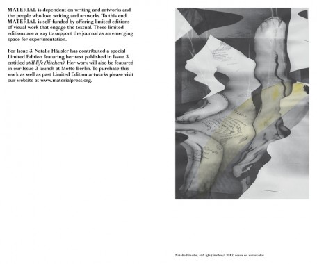
Concatenation (c.1600, from L.L. concatenatus, pp. of concatenare “to link together,” from com- “together”+ catenare, from catena “a chain”) seemed an appropriate word for our editorial method. An unlikely assemblage of texts becomes connected through this process; uncanny linkages emerge. Wyeth appears twice. Performances interact. In this issue: voices that duel, voices that parrot, voices that hypothesize, translate, and meditate, voices that speak simultaneously. As Roland Barthes writes, we have assembled these textual events, as “pleasure in pieces; language in pieces; culture in pieces,” to build upon one another into something new.*
*Roland Barthes, The Pleasure of the Text, trans. Richard Miller (New York: Hill and Wang, 1975), p. 51
CONTRIBUTORS
Farrah Karapetian, Paul Zelevansky, Renee Petropoulous, Nate Harrison, James Welling, Natalie Häusler, Harold Abramowitz, Shana Lutker Stephanie Taylor, Alice Könitz, Frank Chang, and Emily Mast.


Alice Konitz, Andrew Wyeth, Art, Catherine Guiral, Concatenare, Criticism, Daniel Lucas, Design, Distribution, Dorit Cypis, Emily Mast, Farrah Karapetian, Frank Chang, Ginny Cook, Harold Abramowitz, James Welling, John Stezaker, Jonathan Miles, Kim Schoen, MATERIAL Press, Natalie Häusler, Nate Harrison, Olivier Richon, Paul Zelevansky, Quentin Walesch, Renee Petropoulous, Richard Miller, Roland Barthes, Shana Lutker, Stephanie Taylor, Theory, Thomas Lawson, Typecraft Wood & Jones, Typography, Wendy Schoen, Zak Jensen

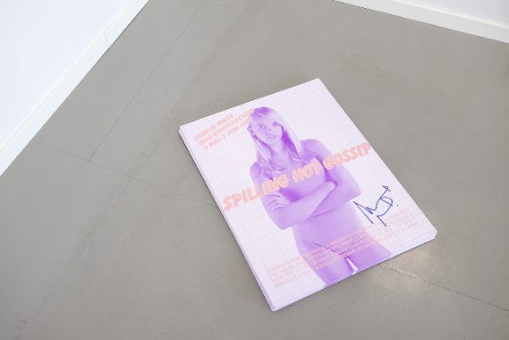
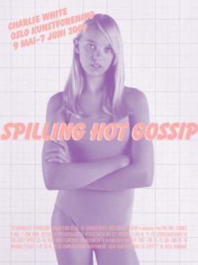
Charlie White, Spilling Hot Gossip
Poster, 100 lb matte coated paper, offset 2/0, 18 x 24 inches
Edition of 500
Unsigned, unnumbered
Published by Oslo Kunstforening
$12.00 ·
Collaboration with
Charlie White and design of poster/take away for the exhibition
Spilling Hot Gossip a selection from
The Girl Studies at
Oslo Kunstforening.
“Portraiture has always been motivated by two competing and overlapping desires: the desire to record, and the desire to be recorded. Artists Katy Grannan and Charlie White have examined this tension, exploring concepts of identity and subjectivity in a world increasingly dominated by media representations of the ideal self. The Sun and Other Stars presents two bodies of work that map the fragility and resilience of individuality in contemporary Western culture.
Grannan’s unflinching portraits capture adult subjects along the sun-struck boulevards of the American West, transforming them from obscurity to individuality with pathos and candor. White’s series of blonde teenage girls frames the popular and tyrannical appetite for celebrity with a deadpan lack of sentimentality. These two photographic series, accompanied by Grannan’s first film project and White’s new animation and personal collections of mass-culture ephemera, provide a visual vocabulary for an examination of the human subject and the encumbering effect of desire and aspiration.”
— Britt Salvesen, The Sun and Other Stars: Katy Grannan and Charlie White


Art, Britt Salvesen, Charlie White, Distribution, Jonathan Maghen, Katy Grannan, Oslo Kunstforening, Photography, Posters, Textfield, Typography

The Book Trust Prospectus
Edited by Benjamin Critton, Harry Gassel, Brendan Griffiths, Zak Klauck and Mylinh Nguyen
Softcover, 160 pp., offset 1/1, 4.25 x 7 inches
Edition of 500
ISBN 978-1-928570-15-8
Published by IFS, Ltd.
$19.10 ·
The Book Trust, a site-specific publication and installation, was originally presented at the NY Art Book Fair, 5–7 November, 2010. During those days, the semi-fictional
Investment Futures Strategy, Ltd., comprised of five graduate students from the Department of Graphic Design at the Yale University
School of Art, offered an original publication for trade in a series of barters executed by its authors.
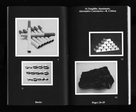
The Trust and the accompanying Book Trust Prospectus address matters of micro-economy and distribution, as well as prescribed versus perceived value. The project suggests a new currency specific to the setting of the Book Fair, a context in which a distinct set of commodities is exchanged by like-minded vendors in a finite space and time. It is only in this setting that a book could be posited as capital — a literal stand-in for the money that commonly exchanges hands at the Fair. Perceived worth is thus no longer dictated by edition or price, but instead by a trader’s subjective notion of the values they assign each book.
Over the three days of the Fair, the book, produced in a fixed quantity of 500, varied in value as each negotiation determined and redetermined its worth in the marketplace. With each transaction, the Prospectus assumed the value of the book for which it was exchanged. The traded commodities now comprise The Book Trust — a value-appreciating book bank. By trading with IFS, Ltd., participants acquired a single theoretical share of the bank, the Prospectus acting as a document of that transaction. In framing the project in a format similar to that of a stock exchange, IFS, Ltd. hopes that the Trust emphasizes the tenuous, abstract value of the book: as a designed object, as a medium for content, as a traded commodity, and as a symbol of participation in the project itself.
Prospectus
The Book Trust Prospectus is, in non-equal parts: a local currency, a stock prospectus for The Book Trust, an exploration into the nature of small-scale publishing and its presence at the NY Art Book Fair (R. Giampietro), a survey of precedented alternative currencies (B. Critton), a platform for hyperbolic re-representations of anonymous fiat money (R. Rozendaal), a foray into corporate branding and rebranding (Metahaven et al.), a proposal for a time-based repurposing of existing banknotes (N. Hirsch & Z. Kyes), an analysis of the current state of [art] book-publishing and -design (L. v. Deursen et al.), a venue for research into non-essential commodity futures like tulips and Beanie Babies™ (H. Gassel), a profile of independent art book vendors (Golden Age), and a podium for experimentation with anti-counterfeiting guilloché renderings (B. Griffiths & Z. Klauck). It is the story of its own making and financing as well as an evaluation of the context in which it was made and financed. The Prospectus is a 160-page, perfect-bound, one-colour book, offset-printed in an edition of five hundred by GHP printing in West Haven, Connecticut, USA.
Alexander Rives, Art, Benjamin Critton, Brendan Griffiths, Business, Design, Distribution, Golden Age, Harry Gassel, IFS Ltd., Linda van Deursen, Metahaven, Mylinh Nguyen, Nikolaus Hirsch, Rafael Rozendaal, Rob Giampietro, The Book Trust, Typography, Yale University School of Art, Zak Klauck, Zak Kyes

Sharmini Pereira, Oliver Knight and Rory McGrath, Footnote to a Project*
Softcover, 536 pp., offset 4/1, 210 x 310 x 35 mm
Edition of 2000
ISBN 978-0-9560704-5-6
Published by Abraaj Capital Art Prize
$35.00 ·
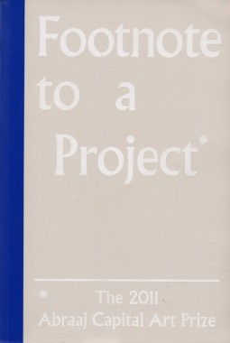
Conceived in collaboration with curator Sharmini Pereira design studio OK-RM and published on the occasion of the 2011 Abraaj Capital Art prize, Footnote to a Project* is a collection of images, citations and references that support and inform the creation of the five selected artworks. Informed by the book’s title, the headline concept was to express the historical traditions of footnoting and its relationship with reading and writing. The designers adopted the use of a variety of typographic symbols traditionally used by type setters to indicate footnotes. The book takes the form of an enlarged paper back and is split into 5 equal parts — one for each artist — providing an in-depth documentation of the works through images and extended captions. The book is accompanied by two book marks intended to facilitate navigation between image and text.
Abraaj Capital Art Prize, Art, Art Dubai, Culture, Design, Distribution, Hamra Abbas, Jananne Al-Ani, Joanne Bernstein, Jonathan Katona, Laura Egerton, Michael Bodiam, Nadia Kaabi-Linke, OK-RM, Oliver Knight, Rory McGrath, Sharmini Pereira, Shezad Dawood, Thomas Brown, Timo Nasseri, Toby Jury Morgan, Typography

MacGregor Harp and Victor Hu, MS Sans
Softcover, 84 pp., offset 1/1, 6 x 8 inches
Edition of 500
Published by Cheap Art America
$5.00 ·
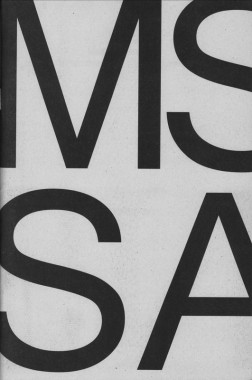
A celebration of the mundane. MS Sans invites thirteen contributors to explore the potential of the typeface Microsoft Sans.
“Each glyph feels as if constructed from rigid individual bits expressing no empathy for the bows and straights of the other. Compare these letterforms to the negative spaces of its progenitor Helvetica; whence MS Sans borrowed its original file name, helv.tff. Inspect closely how the stems of the lowercase b, d, g, p, and q bend not to their respective bowls. O, daughters and sons of the New House what brother of Arial is this? What absent father’s nose is present in this numeral 1? And to whose crooked grandmother do we blame thine unspinely 8? Yet take no offense. Similar results manifest when a gaze is exercised on your humble narrator.”
— Stewart Smith
Anthony Salvador, Art, Cheap Art America, Chris Palazzo, Culture, Design, Distribution, GUNMAD, Jeremy Landman, Jiminie Ha, MacGregor Harp, Microsoft, MS Sans, Nicolas Borel, Project Projects, Sam Farfsing, Samuel Banziger, Stewart Smith, Typography, Victor Hu

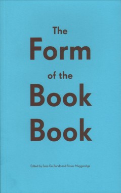
Sara De Bondt and Fraser Muggeridge, The Form of the Book Book
Softcover, 96 pp., offset 2/1, 140 x 230 mm
Second edition
ISBN 978-0-9562605-7-4
Published by Occasional Papers
$22.00 · out of stock
A collection of essays on book design by Catherine de Smet, James Goggin, Jenni Eneqvist, Roland Früh, Corina Neuenschwander, Sarah Gottlieb, Richard Hollis, Chrissie Charlton, Armand Mevis.
Armand Mevis, Calverts Printers, Catherine de Smet, Chrissie Charlton, Corina Neuenschwander, Criticism, Distribution, Fraser Muggeridge, James Goggin Jenni Eneqvist, Occasional Papers, Richard Hollis, Roland Früh, Sara De Bondt, Sarah Gottlieb, Typography

Sara De Bondt and Fraser Muggeridge, The Master Builder
Softcover, 28 pp., offset 4/4, 130 x 230 mm
Edition of 1000
ISBN 978-0-9562605-0-5
Published by Occasional Papers
$8.00 · out of stock
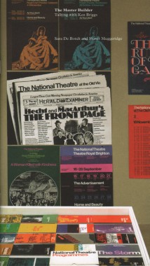
The Master Builder: Talking with Ken Briggs by Sara De Bondt and Fraser Muggeridge, is a slim (28 pp. plus covers) volume, the size (and look and feel, with coated and uncoated stocks) of a typical Briggs NT programme. It comprises an interview with Briggs, a short biography and portrait, plenty of pictures (24 in colour) of his pioneering posters and programmes for the theatre in the 1960s and 70s, and a detail of Briggs’ slide archive, carefully labelled with Dymo tape.
When asked about his structured, asymmetrical booking forms for the theatre, Briggs claims ‘I didn’t care about beauty or the lack of it. They are purely typographic,’ then goes on to explain his colour system: ‘from warm colours in winter to cool colours in summer: red, ochre, purple, bright blue and so on.’ Which is why he was known as the colourist.
Antony Hudek, Distribution, Fraser Muggeridge, Graphics, Illustration, Ken Briggs, National Theatre, Occasional Papers, Sara De Bondt, Typography

Jürg Lehni and Alex Rich, Research Notes
Softcover, 20 pp., offset 1/1, 195 x 255 mm
Edition of 500
ISBN 978-3-905714-95-1
Published by Nieves
$14.00 ·
In an attempt to celebrate how we find ourselves doodling while on the phone, testing pens in stationery shops, our belief in folklore, the need to misuse technology or whose idea it was to fly aero planes in formation to write messages across our skies.
The research notes selected from the archive A Recent History of Writing & Drawing hopefully provide references to things old, new and maybe forgotten which together can offer an alternative understanding of our habit to document thoughts and ideas. Upending assumptions that any one kind of communication is more authentic, more direct or more valid that any other, A Recent History of Writing & Drawing finds meaning, texture and poetry in the most unlikely places.
Alex Rich, Art, Culture, Design, Distribution, Drawing, Jürg Lehni, Nieves, Science, Typography

Jürg Lehni and Alex Rich, Empty Words
Softcover, 24 pp., cut paper, 195 x 255 mm
Edition of 500
ISBN 978-3-905714-93-7
Published by Nieves
$24.00 ·

Jürg Lehni and Alex Rich, News
Softcover, 24 pp., offset 1/1, 195 x 255 mm
Edition of 500
ISBN 978-3-905714-94-4
Published by Nieves
$14.00 ·
The
Speed-i-Jet, a mobile pen-printer manufactured by
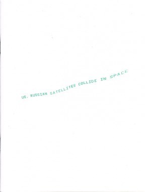
Reiner (Germany), is a device built around an industrial inkjet cartridge / printing head. With its clumsy user interface and 30 character maximum capacity, this charming parasitical product prompted the discussion of possible uses for such a device. Together with the curatorial staff of the institution, daily news headlines were selected and transferred onto the devices. Holding and moving the device like a pen, visitors could experience the writing of texts to which the author is ambiguous.
The headlines were collected during Things to Say at Kunst Halle Sankt Gallen, Switzerland, 14 February — 12 April, 2009.
Alex Rich, Art, Design, Distribution, Jürg Lehni, Kunst Halle Sankt Gallen, Nieves, Typography

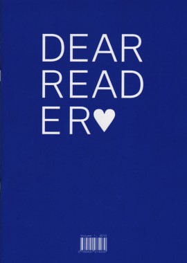
Dear Reader, Vol. 1
Softcover, 36 pp., offset 2/2 + spot varnish, 210 x 297 mm
Edition of 500
ISSN 2211-1085
ISBN 978-94-90974-03-9
Published by Carvalho Bernau
$13.00 · out of stock
A collection of obsessions, oblique references and footnotes of design processes — though not necessarily texts about design. The layout is appropriately diverse and eclectic for the bandwidth of texts, layering different formats and texts, as a tongue-in-cheek reference to the design shtick of publications with different paper formats. Here we present three iconic formats in emphasized-as-fake three-dimensionality, on four different papers and more inks than you would think.
Dear Reader was created partly from a primordial graphic designers’ urge to publish something and to share texts that are dear to us, partly in celebration of Atelier Carvalho Bernau’s approximate fifth anniversary, and partly as a vessel to showcase our type design work in a manner that circumvents the conventions and the visual clichés of the type specimen.
Adolf Loos, AG Fronzoni, Barbara Wright, Carvalho Bernau, Design, Distribution, El Lissitzky, Frederico Duarte, John Cage, Kai Bernau, Morton Feldman, Raymond Queneau, René Hague, Susana Carvalho, Typography
