Eleven Minus One
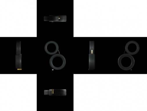
Amir Zaki, Eleven Minus One
Softcover, 122 pp., offset 4/4, 9 x 9 inches [26 x 36 inches unfolded]
Edition of 500
ISBN 978-0-26172-2-9
Published by LAXART
$75.00 ·
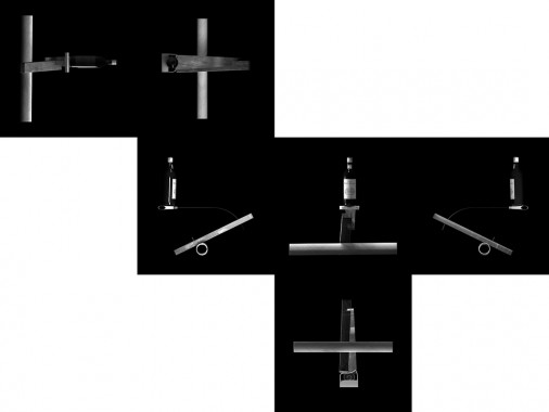
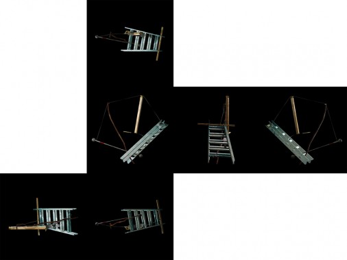
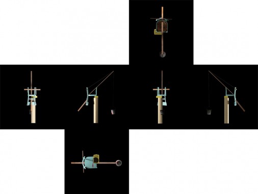
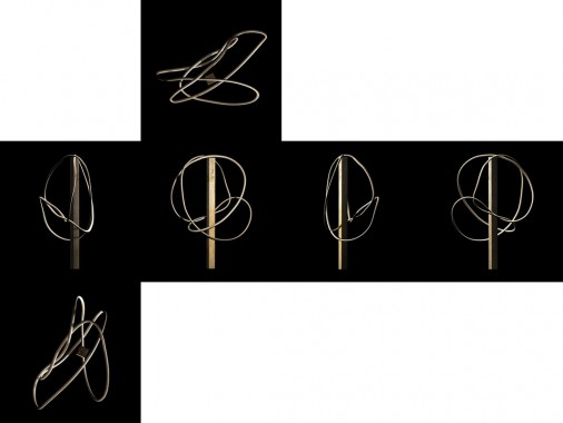
The book is a complex foldout design that is quite difficult to describe in text. It is ten double-sided square pages. Each page spread unfolds into unique configurations of six squares that represent all sides of a cube. The images on each unfolded page spread depict 3D digital recreations of photographs from the series Equilibres by Swiss artist duo Peter Fischli and David Weiss. When fully unfolded, the book opens up to approximately 27 x 36 inches. It is an interactive object, and can be folded and unfolded in multiple ways, creating grids, cubes, and unfolded boxes, each creating a unique experience and juxtaposition of images. It is important to recognize the book in terms of a limited edition or a multiple. It is also more of an object with sculptural qualities and a tactile nature than a ‘book’ in the traditional sense.
The Line
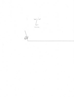
Saul Steinberg, The Line
Leporello Foldout, 30 pp., offset 1/1, 195 x 255 mm [5850 x 255 mm unfolded]
Edition of 1000
ISBN 978-3-905714-80-7
Published by Nieves
$24.00 · out of stock
The Line, the original a 10-meter-long drawing with 29 panels that unfold, accordion fashion, is Steinberg’s manifesto about the conceptual possibilities of the line and the artist who gives them life. His drawing hand begins and ends the sequence, as the simple horizontal line that hand creates metamorphoses into, among other things, a water line, laundry line, railroad track, sidewalk, arithmetic division line, or table edge; near the end, the curlicues etched by the iceskater’s blade remind us of the role calligraphy plays in Steinberg’s art.
The Line was designed for the Children’s Labyrinth, a spiraling, trefoil wall structure at 10th Triennial of Milan, a design and architecture fair that opened in August 1954. The drawing, photographically enlarged and incised into the wall, was one of four Steinberg conceptions used on the labyrinth.
Multiples 1982-1997
Martin Kippenberger, Multiples 1982-1997
Softcover, 144 pp., offset 4/4, 215 x 270 mm
Edition of 2000
ISBN 9783883756783
Published by Walther König
$35.00 · out of stock
Wouldn’t it be nice
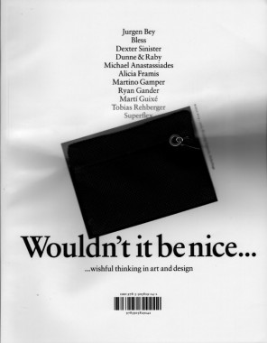
Katya Garcia-Anton and Emily King, Wouldn’t it be nice
Softcover, 300 pp., offset 4/1, 232 x 297 mm
Edition of 2000
ISBN 978-3-905829-24-2
Published by JRP|Ringier
$42.00 ·
The publication includes interviews with Jurgen Bey, Bless, Dexter Sinister, Dunne & Raby and Michael Anastassiades, Alicia Framis, Martino Gamper, Ryan Gander, Martí Guixé, Tobias Rehberger, and Superflex. Fully illustrated, the book presents a number of projects that have been specially commissioned for the exhibition. Quoting the aesthetic of the glossy magazine, the publication is designed by London-based group Graphic Thought Facility, and has attached to each cover a Bless N°14–2000, Shopping Supports Stickerbags self-adhesive purse/multiple.
General Idea, AIDS Stamps
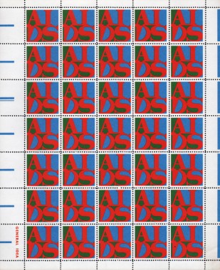
General Idea, AIDS Stamps
Perforated paper, offset 3/0, 210 x 255 mm
Edition unknown, unsigned
1988 / 8804
Published by General Idea
out of print
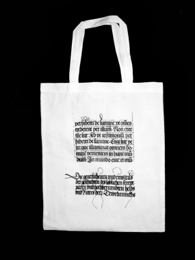
Performance
Harsh Patel, Performance
Cotton tote bag, screenprint 1/0, 297 × 420 mm
Published by Harsh Patel
$25.00 ·
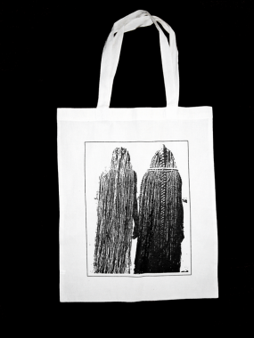
First
Harsh Patel, First
Cotton tote bag, screenprint 1/0, 297 × 420 mm
Published by Harsh Patel
$25.00 ·
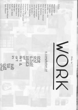
This is Work
Bas Morsch, This is Work
Softcover, 10 posters/80 pp., offset 4/1, 210 x 297 mm
Edition of 1000
Published by Bas Morsch
$5.00 ·
Signature (Poster)
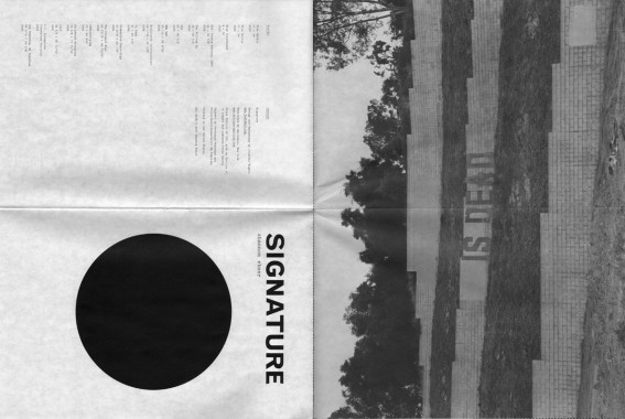
Shannon Ebner, Signature, offset poster, 24 × 36 inches (above: 12 x 18 inches folded)
Shannon Ebner, Signature (Poster)
Poster, perforated, offset 4/1, 6 x 9 inches [24 × 36 inches unfolded]
Edition of 280
Published by Wallspace
$10.00 · out of stock
“The Doom,” and “The Day—Sob—Dies.”
—Todd Alden
A La Cach Cachi Porra
Manuel Raeder, A La Cach Cachi Porra
Softcover, 120 pp., offset 3/1, 17 x 24 cm
agenda/calendar/file folders
Edition of 500
Published by Manuel Raeder
$40.00 ·
A calendar/day-planner for 2009 by graphic designer Manuel Raeder, exploring the possibilities of being a time storage device in a book format. Each copy has a different color scale iris print and every sixth page needs to be torn open by the reader.
Goodbye
Harsh Patel, Goodbye
Poster, offset 1/0, 24 x 36 inches
Edition of 250
Published by Harsh Patel
$15.00 ·
Notebook (Yellow)
Vier5, Notebook (Yellow)
Softcover, 24 pp., offset 1/1, 210 x 297 mm
Edition of 500
Published by Vier5
out of print
The work of Vier5 is based on a classical notion of design. Design as the possibility of drafting and creating new, forward-looking images in the field of visual communication.
Notebook (Magenta)
Vier5, Notebook (Magenta)
Softcover, 24 pp., offset 1/1, 210 x 297 mm
Edition of 500
Published by Vier5
out of print
The work of Vier5 is based on a classical notion of design. Design as the possibility of drafting and creating new, forward-looking images in the field of visual communication.
