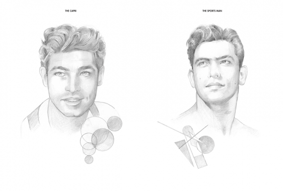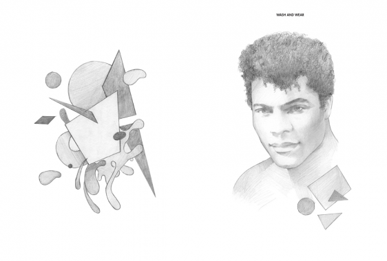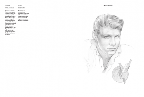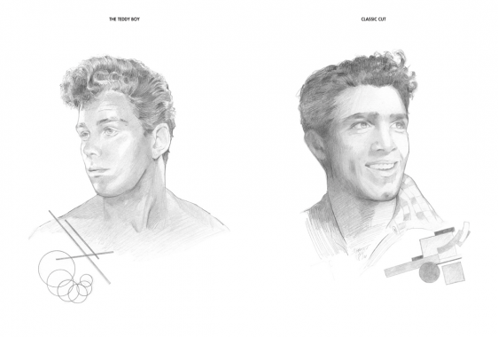

Silvia Prada, The New Modern Hair: A Styling Chart
Softcover, 32 pp., offset 1/1, 200 x 270 mm
Edition of 500, hand numbered
ISBN 978-0-615-66610-5
Published by cultureEDIT and Silvia Prada
$35.00 ·
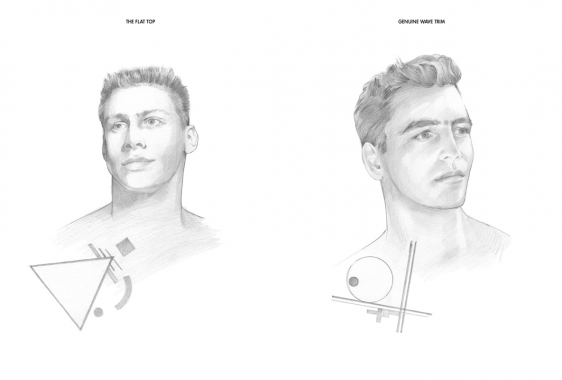
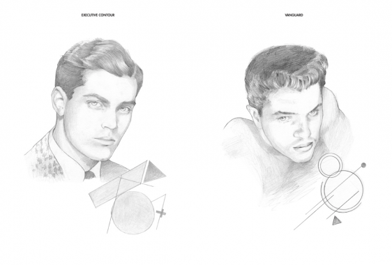
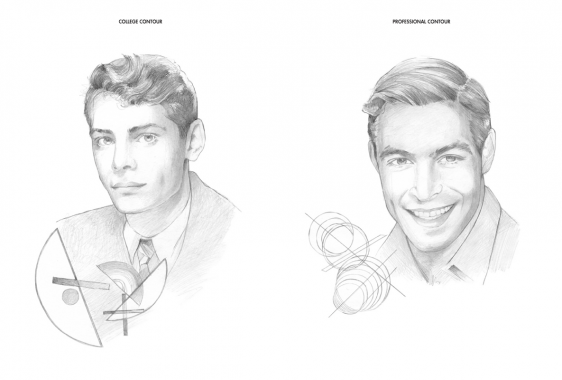
THE NEW MODERN HAIR: A STYLING CHART features a series of stylized portraits highlighting male hairstyles juxtaposed with geometric drawings. The book pays homage to the barbershop and is an artistic representation of the subtle nuances and cues that help define the male persona, identity and representation within the parameters of visual and popular culture. Through this series of work, Prada is capturing the typecasting and idealized character building that has become ingrained in our minds through media, pop culture and iconography.
The portraits — with names ranging from The Flat Top to Executive Contour — feature commentary and meticulous instructions on how to obtain each look in order to resemble the lifestyle pictured. The geometric drawings, all whimsical remixes of 20th-century art movements such as Bauhaus, De Stijl and Russian Constructivism, highlight the emphasis on the shape for each hairstyle and command a manifesto for the references that each portrait points to.


Art, Barbershop, CultureEDIT, Design, Distribution, Fashion, Holli Smith, Joakim Andreasson, Liza Kaplan, Michael Forrey, Miguel Figueroa, Setanta, Silvia Prada, Styling


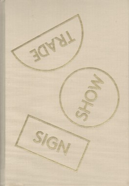
Thomas Macker, SIGN SHOW TRADE
Hardcover, 88 pp., offset 4/4, 180 x 265 mm
Edition of 500
ISBN 978-0-615-76630-0
Published by In The Pines Books
$45.00 ·
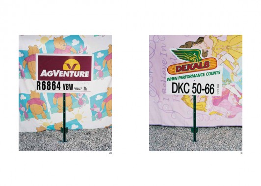
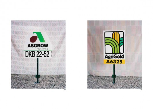
Conceptually, the publication is structured horizontally, with two formally similar series of photographic works bridged by photographs and sculptural objects that offer a dialogic counterpoint to the main series. The first group of photographs focuses around seed signs and sacks advertising distinct crop strains of genetically modified corn and soy. The individual sacks and signs are set up at the center of still life compositions, staged in the basement of Macker’s home in Jackson Hole, Wyoming. The sacks hang from the fiberglass insulation and wooden boards of the basement ceiling, while the signs are placed in gravel on the floor. The backdrops, often constructed by hanging used textiles against the gold-painted walls of the basement, offer glimpses of American nostalgia — old quilts featuring Winnie The Pooh, The Transformers, and Disney Princesses, along with faded floral sheets, tie-dye hangings, penguins. The series is presented as a calendar of images; each photograph is named for a month of the year, with an additional one for each season. The repetition in the photographs acts as a meditation on the ways we mark time, while the content of the images posits company branding as a primary signifier of cultural and personal identity: nostalgia and desire for meaning coopted by companies that alter the foundation of our sustenance.
In Macker’s work, the ‘seed’ — as altered commodity — locates the collision between the idea of the natural world as something outside and other than human, and the natural world as what we are (as animals who eat food grown from seeds, eat animals who have eaten plants grown from seeds, breathe air full of oxygen created by photosynthesis, and on and on). This space of collision and contradiction is where Macker argues we reside, and the photographic and sculptural pieces that bridge the two still life series in the exhibition offer a glimpse of the effects of that lived contradiction. Dog God | Man Camp | Big Piney, WY shows a coyote impaled by a pole and posed with its head up (as if howling), a scene Macker found and documented next to one of the “Man Camps” of trailers that have sprung up throughout the Gaslands of Wyoming, the Dakotas, Colorado and Iowa to house temporary gas line workers. Another shows the snow-filled landscape where Matthew Shephard was beaten and killed, the only marker of that moment of cultural mourning and instigator of progressive action now a gas company pole. Bumper stickers Macker stole from trucks in Wyoming and printed onto vintage glass tiles depict bikini-clad women alongside text that reads ‘Just Frack It’, and, a digitally rendered bust of a disembodied pregnant torso hangs next to a digitally rendered image of a Molatov cocktail. Reproduction, destruction, re-birth, identity, and verbal and physical languages of dominance comingle with cultural hope and yearning — a yearning that always seems to leave violence in its wake.
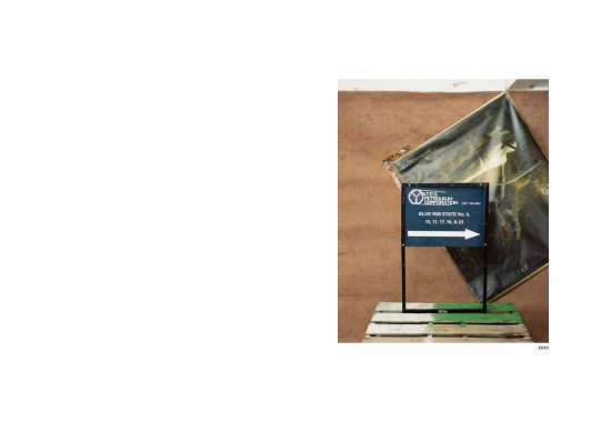
In the second still life series, the seed signs have been replaced by gas company signage. These signs, stolen by Macker during drives across the Gaslands, functioned as markers for the temporary roadways that crisscross the landscape where gas lines are in construction. In this series, the signs rest on top of a wooden crate instead of being placed in gravel, and the backdrop is now constructed of brown carpet. In front of the carpet, Macker has hung reproductions of 19th and 20th century artwork mythologizing woodcutters. Behind a Unit Drilling Company sign directing us towards Rig 24, we see Winslow Homer’s The Woodcutter, here featured on a living room wall as part of an interior design advertisement. In Der Holzfäller, Ferdinand Hodler, 1910, a Danger Benzene Cancer Hazard sign accompanied by a potted plant stands in front of Ferdinand Hodler’s Der Holzfäller. Co-opting these already-reproduced artworks, Macker highlights the historic glorification of human dominance over nature, as well as the problematic placement of the artist within this glorification, as a symbol and actor of these same problematic humanist ideals. The scenes are constructed to be visually satisfying, uncomfortable, humorous, claustrophobic, and unexpectedly personal, reflecting our continued desire to feel communal pride in our accomplishments, as well as the consequences of a system in which the structure for expansion we have created necessitates an unwillingness to recognize the fallibility or responsibility of power.


Agriculture, Art, Corn, Distribution, Ferdinand Hodler, Fracking, GMOs, Halliburton, In The Pines Books, Jackson Hole, LL Brown, Monsanto, Oil, Photography, Soy, Thomas Macker, Wyoming


Alain Arias-Misson, From the Cutting-Floor of the Public Poem
Softcover, 80 pp., offset 4/1, 165 x 245 mm
Edition of 2000
ISBN 978-94-9069-315-2
Published by MER. Paper Kunsthalle
$32.00 ·
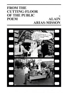
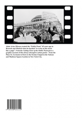
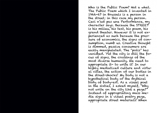
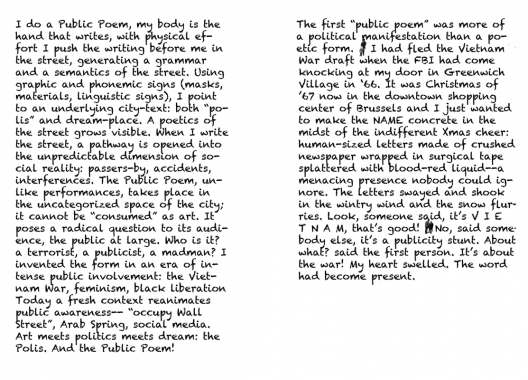
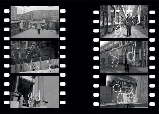
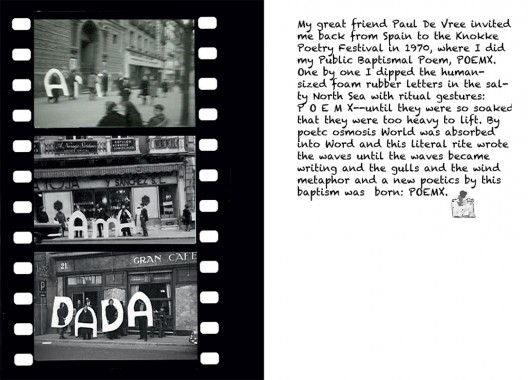
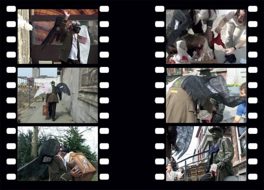
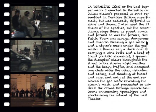
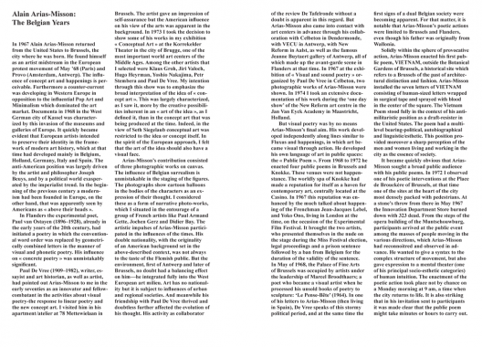
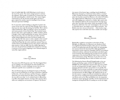
Alain Arias-Misson created the “Public Poem” 45 years ago in Brussels and Madrid when he decided “to write on the street like a page.” From the Cutting-Floor of the Public Poem gives a graphic account of this always disruptive urban poet — from the Place St.-Germain in Paris to the Sixtine Chapel in the Vatican and Madison Square Garden in New York City.


Alain Arias-Misson, Art, Distribution, MER. Paper Kunsthalle, New York, Performance, Poetry, Roger D'Hondt


Herman Asselberghs and Dieter Lesage, After Empire
Softcover, 256 pp., offset 1/1, 110 x 180 mm
Edition of 2000
ISBN 978-94-9069-394-7
Published by MER. Paper Kunsthalle
$20.00 ·
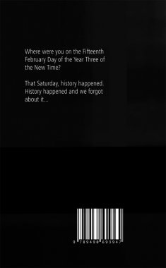
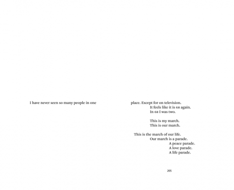
After Empire is published on the occasion of the group show ‘Blijven Kijken’, an exhibition curated by Pieter Van Bogaert at M-Museum on (dis)appearing images and the boundaries of representation. Central in the exhibition is the 2010 video After Empire by Herman Asselberghs. This video is a tentative reflection on positive forms of collective resistance against war as well as emancipatory representations concerned with it. This publication considers a possible alternative for an iconic image drawn from our collective memory: a hijacked plane hitting the second tower of the WTC in 2001, New York. The book proposes an alternative for our collective history: the 15th of February 2003. On that day 30 million citizens across the planet marched against the unilateral decision by the American government to start a pre-emptive war against Iraq under the auspices of “the war on terrorism”. 2/15 was the greatest peace demonstration since the Vietnam war and probably the biggest protest march ever to take place. The war did happen, but this world day of resistance could very well mark the beginning of the 21st century. 2/15 instead of 9/11: a key date in the writing of a history of global contestation in the struggle between two superpowers: the United States against public opinion worldwide.


Art, Criticism, Dieter Lesage, Distribution, Herman Asselberghs, Iraq, M-Museum, MER. Paper Kunsthalle, Philosophy, Pieter Van Bogaert, Politics

K8 Hardy, Frank Peter John Dick
Softcover, 52 pp., offset 4/4, 230 x 300 mm
Edition of 500
ISBN 978-0-9822090-2-8
Published by Capricious
$25.00 ·
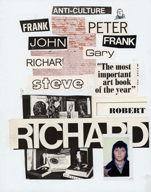
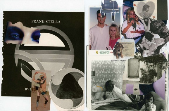
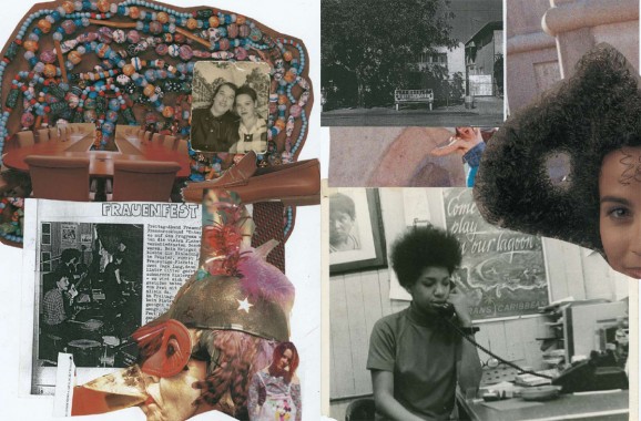
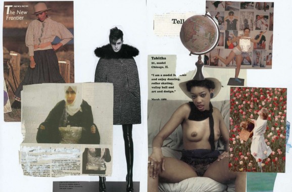
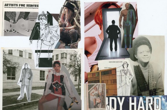
K8 Hardy’s work riffs on pop culture and all the images we encounter as consumers. The art she exhibits are photographs and sculptures, but part of her process is gathering masses of images from disparate sources and obsessively collaging them together. In a sense, these collages are edits of photos torn from magazines, printed advertisements, and other visual imagery that Hardy finds compelling. Yet they also include her darkroom test strips and snapshots found at the junk store. These collages were never originally intended for exhibition or print, but merely research for the artist’s work. It was only after a few people saw them in her studio that she was encouraged to show them. For this reason, the collages are powerful and weighty; each is it’s own essay. Hardy has made visual examinations that deal with complicated ideas, issues of representation, phenomenon in style, and playful contemplations of fashion.
K8 Hardy (USA, b. 1977) is a New York-based artist who mines popular culture for material and has no regard for originality. She has no allegiance to any particular medium, but performance is a thread that weaves through her body of work. Hardy eschews virtuosity to craft and is currently exploiting photography. She believes in the power of flamboyant and bold gestures, and the conversations of play, which come across in her endeavors toward total expression. The surface is often used as a decoy in her work to address the political conditions of its production. She has recently been working on a series of photographs called the “Position Series” that employ the tropes of self-portraiture and abstract photography. Hardy is a founding member of the queer feminist journal and artist collective, LTTR. She has shown internationally at spaces including: Reena Spaulings Fine Art, NY; The Tate Modern, London; Artist Space, NY: Galerie BaliceHertling, Paris; Galerie Sonja Junkers, Munich; PS1 MOMA, NY; Higher Pictures, NY; Biennial of Photography and Visual Arts, Heerlen, NL; and the Brooklyn Museum, Elizabeth A. Sackler Center for Feminist Art, NY.


A.K. Burns, Art, Capricious, Collage, Culture, Distribution, Eileen Myles, K8 Hardy, LTTR, Photography, Ulrike Müller

Ed Ruscha — Books & Co.
March 5 — April 27, 2013
Opening: Tuesday, March 5, 6-8pm
Organized by Bob Monk
Gagosian Gallery
980 Madison Ave.
New York, NY 10075
Tuesday-Saturday 10-6pm
New York Times Preview.
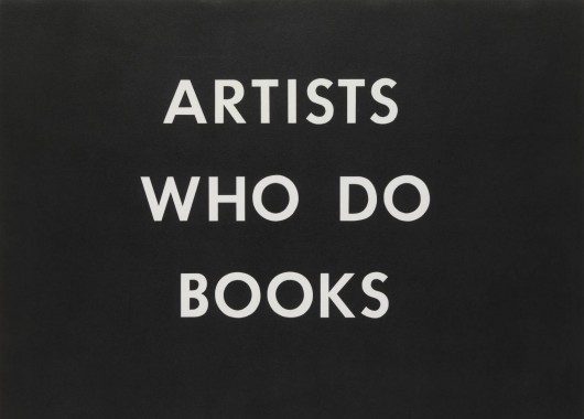
Gagosian Gallery is pleased to present an exhibition of Ed Ruscha’s legendary artist books together with books and works of art by more than 100 contemporary artists that respond directly and diversely to Ruscha’s original project. Organized by Bob Monk, “Ed Ruscha Books & Co.” has been drawn from private collections, including Ruscha’s own. Most of the books are installed so that viewers can interact with them and browse their pages.
Inspired by the unassuming books that he found on street stalls during a trip to Europe, in 1962 Ruscha published his first artist book, Twentysix Gasoline Stations under his own imprint, National Excelsior Press. A slim, cheaply produced volume, then priced at $3.50, Twentysix Gasoline Stations did exactly what its title suggests, reproducing twenty-six photographs of gasoline stations next to captions indicating their brand and location. All of the stations were on Route 66, the road mythologized by the eponymous TV series and in John Steinbeck’s The Grapes of Wrath. Ruscha’s book traveled more or less west to east, from the first service station in Los Angeles, where he moved as a young man, back to Oklahoma City, where he grew up.
Initially, the book received a poor reception, rejected by the Library of Congress for its “unorthodox form and supposed lack of information.” However, during the sixties it acquired cult status, and by the eighties it was hailed as one of the first truly modern artist’s books. Ruscha followed up Twentysix Gasoline Stations (1962) with a succession of kindred publications, including Some Los Angeles Apartments (1965), Nine Swimming Pools and a Broken Glass (1968), and Real Estate Opportunities (1970), all of which combined the literalness of early California pop art with a deadpan photographic aesthetic informed by minimalist sequence and seriality.
As the prolific and playful examples in the exhibition attest, Ruscha’s artist books have proved to be deeply influential, beginning with Bruce Nauman’s Burning Small Fires (1968), for which Nauman burned Ruscha’s Various Small Fires and Milk (1964) and photographed the process. More than forty years later, photographer Charles Johnstone relocated Ruscha’s Twentysix Gasoline Stations in Cuba, producing the portfolio Twentysix Havana Gasoline Stations (2008). The most recent homage is One Swimming Pool (2013) by Dutch artist Elisabeth Tonnard, who re-photographed one of the photographs from Ruscha’s Nine Swimming Pools and a Broken Glass (1968) and enlarged it to the size of a small swimming pool, consisting of 3164 pages the same size as the pages in Ruscha’s original book. The pages of this ‘pool on a shelf’ can be detached to create the life-size installation. Between these early and recent examples are a wealth of responses to Ruscha’s ideas by artists from all over the world, gathered here in this celebratory exhibition:
ABC Artists’ Books Cooperative, Noriko Ambe, Edgar Arceneaux, Eric Baskauskas, Luke Batten / Jonathan Sadler (New Catalogue), Erik Benjamins, Victoria Bianchetti, Doro Boehme, Jeff Brouws, Denise Scott Brown, Wendy Burton, Stephen Bush, Corinne Carlson, Dan Colen, Julie Cook, Jennifer Dalton, Bill Daniel, Claudia de la Torre, Joshua Deaner, Jen DeNike, Eric Doeringer, Stan Douglas, Harlan Erskine, Frank Eye, Kota Ezawa, Robbert Flick, Jan Freuchen, Jochen Friedrich, Thomas Galler, Anne-Valérie Gasc, Steve Giasson, Simon Goode, Oliver Griffin, Daniel S. Guy, Dejan Habicht, Marcella Hackbardt, Sebastian Hackenschmidt, Karen Henderson, Mishka Henner, Kai-Olaf Hesse, Taro Hirano, Marla Hlady, Dominik Hruza, Steven Izenour, Sveinn Fannar Jóhannsson, Taly and Russ Johnson, Charles Johnstone, Rinata Kajumova, Henning Kappenberg, Jean Keller, Shohachi Kimura, Julia Kjelgaard, Joachim Koester, Sowon Kwon, Tanja Lažetic, Gabriel Lester, Jonathan Lewis, Jochen Manz, Michael Maranda, Scott McCarney, Mark McEvoy, Jerry McMillan, Daniel Mellis, Martin Möll, Dan Monick, Jonathan Monk, Simon Morris, Audun Mortensen, Brian Murphy, Toby Mussman, Maurizio Nannucci, Bruce Nauman, John O’Brian, Stefan Oláh, Performance Re-Enactment Society, Michalis Pichler, Tadej Pogačar, Susan Porteous, James Prez, Clara Prioux, Robert Pufleb, Joseph Putrock, Jon Rafman, Achim Riechers, David John Russ, Mark Ruwedel, Tom Sachs, Joachim Schmid, Andreas Schmidt, Jean-Frédéric Schnyder, David Schoerner, Yann Sérandour, Travis Shaffer, Gordon Simpson, Paul Soulellis, Tom Sowden, Kim Stringfellow, Derek Stroup, Derek Sullivan, Yoshikazu Suzuki, Chris Svensson, Eric Tabuchi, Elisabeth Tonnard, John Tremblay, Marc Valesella, Wil Van Iersel, Louisa Van Leer, Robert Venturi, Reinhard Voigt, Alex Von Bergen, Emily Wasserman, John Waters, Henry Wessel, Keith Wilson, Charles Woodard, Theo Wujick, Mark Wyse, Hermann Zschiegner.
“Ed Ruscha Books & Co.” will coincide with the publication of MIT Press’s Various Small Books: Referencing Small Books by Ed Ruscha (2013), which documents ninety-one of the books inspired by Ruscha’s own, reproducing covers and sample layouts from each, along with a detailed description. Various Small Books also includes selections from Ruscha’s books and an appendix listing most of the known Ruscha book tributes.
ABC Artists’ Books Cooperative, Achim Riechers, Alex Von Bergen, Andreas Schmidt, Anne-Valérie Gasc, Art, Audun Mortensen, Bill Daniel, Bob Monk, Brian Murphy, Bruce Nauman, Charles Johnstone, Charles Woodard, Chris Svensson, Clara Prioux, Claudia de la Torre, Corinne Carlson, Dan Colen, Dan Monick, Daniel Mellis, Daniel S. Guy, David John Russ, David Schoerner, Dejan Habicht, Denise Scott Brown, Derek Stroup, Derek Sullivan, Dominik Hruza, Doro Boehme, Ed Ruscha, Edgar Arceneaux, Elisabeth Tonnard, Emily Wasserman, Eric Baskauskas, Eric Doeringer, Eric Tabuchi, Erik Benjamins, Frank Eye, Gabriel Lester, Gagosian Gallery, Gordon Simpson, Harlan Erskine, Henning Kappenberg, Henry Wessel, Hermann Zschiegner, James Prez, Jan Freuchen, Jean Keller, Jean-Frédéric Schnyder, Jeff Brouws, Jen DeNike, Jennifer Dalton, Jerry McMillan, Joachim Koester, Joachim Schmid, Jochen Friedrich, Jochen Manz, John O'Brian, John Tremblay, John Waters, Jon Rafman, Jonathan Lewis, Jonathan Monk, Jonathan Sadler, Joseph Putrock, Joshua Deaner, Julia Kjelgaard, Julie Cook, Kai-Olaf Hesse, Karen Henderson, Keith Wilson, Kim Stringfellow, Kota Ezawa, Larry Gagosian, Louisa Van Leer, Luke Batten, Marc Valesella, Marcella Hackbardt, Mark McEvoy, Mark Ruwedel, Mark Wyse, Marla Hlady, Martin Möll, Maurizio Nannucci, Michael Maranda, Michalis Pichler, Mishka Henner, Noriko Ambe, Oliver Griffin, Paul Soulellis, Performance Re-Enactment Society, Reinhard Voigt, Rinata Kajumova, Robbert Flick, Robert Pufleb, Robert Venturi, Scott McCarney, Sebastian Hackenschmidt, Shohachi Kimura, Simon Goode, Simon Morris, Sowon Kwon, Stan Douglas, Stefan Oláh, Stephen Bush, Steve Giasson, Steven Izenour, Susan Porteous, Sveinn Fannar Jóhannsson, Tadej Pogačar, Taly and Russ Johnson, Tanja Lažetic, Taro Hirano, Theo Wujick, Thomas Galler, Toby Mussman, Tom Sachs, Tom Sowden, Travis Shaffer, Victoria Bianchetti, Wendy Burton, Wil Van Iersel, Yann Sérandour, Yoshikazu Suzuki


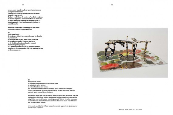
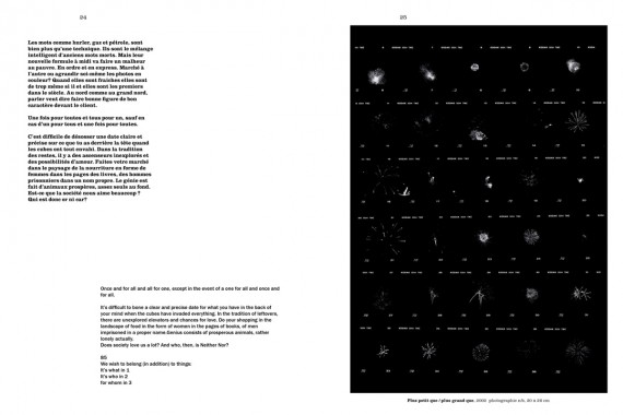
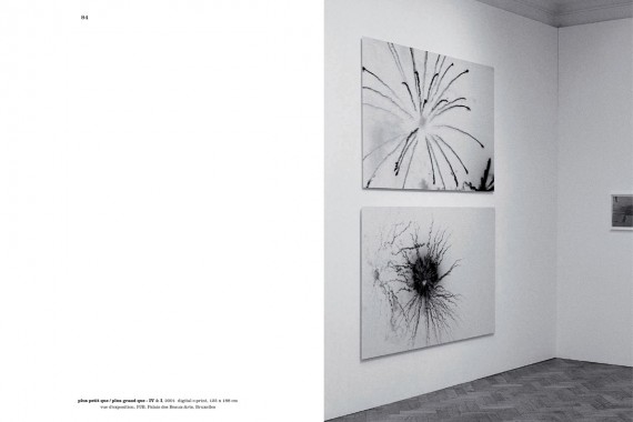
Benoit Platéus, Parties de voyant
Softcover, 100 pp., offset 4/4, 210 x 280 mm
English and French
Edition of 2000
ISBN 978-94-906-9337-4
Published by MER. Paper Kunsthalle
$28.00 ·
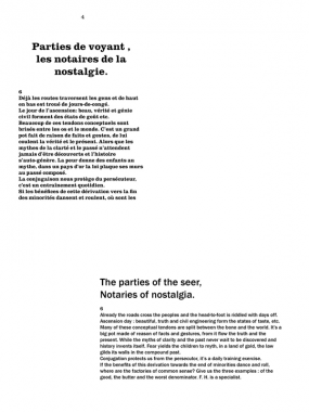
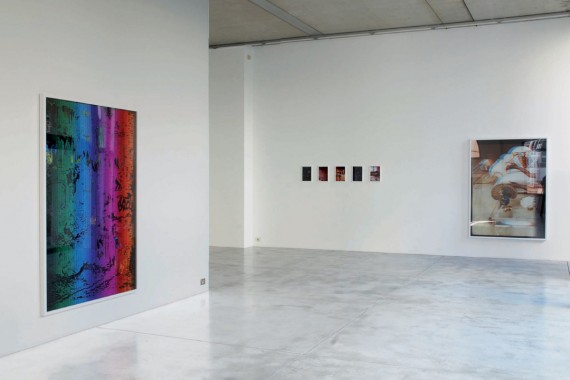
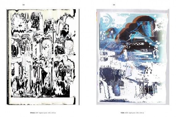
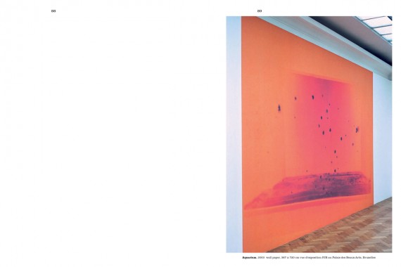
This first work on the Belgian artist Benoit Platéus is a monography as well as an artist’s book. It comprises a selection of works created between 1997 and 2011, as well as a text written by the artist and proposing a direct insight into his universe. Platéus work doesn’t neglect any medium — photography, video, drawing or sculpture — in order to search for ambiguities in the most mundane field of visibility. In this way his art often acts as a ‘psychic apparatus’ that plays on, and questions and reflects the viewer’s perception and consciousness.


Animation, Art, Benoit Platéus, Distribution, Drawing, Film, James W Haenlin, MER. Paper Kunsthalle, Michelle Van Brussel, Photography, Sculpture


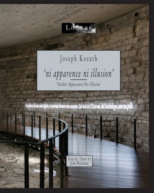
Joseph Kosuth, Neither Appearance Nor Illusion (’ni apparence ni illusion’)
Hardcover, 164 pp., offset 4/4, 260 x 320 mm
English and French
Edition of 5000
ISBN 978-94-906-9303-9
Published by MER. Paper Kunsthalle
$65.00 ·
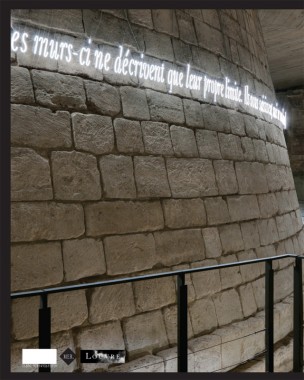
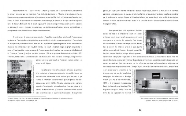
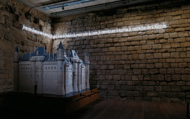
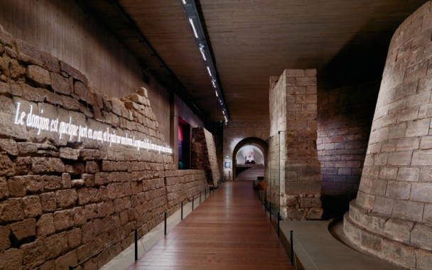
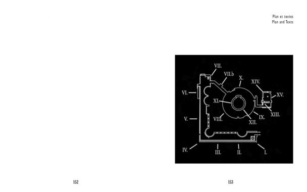
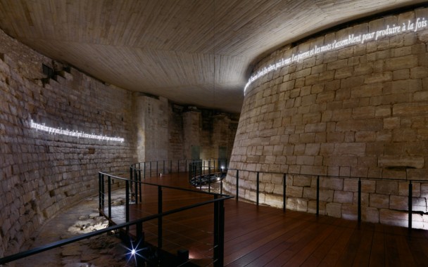
Published on the occasion of Joseph Kosuth’s installation ‘Neither Appearance Nor Illusion’, an exhibition in the Medieval Louvre. Joseph Kosuth installed on the foundation walls of the original Louvre palace 15 neon text lines he appropriated from an artwork he developed to be read on the Internet, a project for young artists at the Brooklyn Museum. In this context combining a medieval archeological site with a historical art institution the exhibition circuit unfolds the field of potential meanings that always has been the hallmark of Kosuth installations. Entitled ‘Neither Appearance Nor Illusion’ in reference to Nietzsche, it is undoubtedly one of the artist’s most successful and spectacular interventions to date.
Texts by Henri Loyrette, Marie-Laure Bernardac and John Welchman and an interview between Joseph Kosuth and Jacinto Lageira.


Antiquity, Art, Brooklyn Museum, Distribution, Fiona Biggiero, Florian Kleinefenn, Friedrich Nietzsche, Henri Loyrette, Installation, Jacino Lageira, John Welchman, Joseph Kosuth, Liz Dalton, Luc Derycke, Marie-Laure Bernadac, MER. Paper Kunsthalle, Musee du Louvre, Sculpture


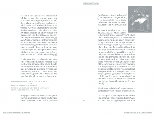
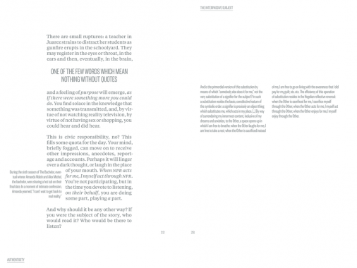
Tyler Coburn, I’m that angel
Softcover, 96 pp., offset 1/1, 6 x 9 inches
Book and performance
Edition of 500
Published by Tyler Coburn
$30.00 ·
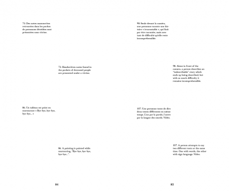
I’m that angel is a cycle of writings and performances that explores the contemporary conditions of how we work on and against the computer, narrated from the cognitive cell of one highly neurotic user. The project considers the master narratives of technological and socioeconomic progress that have naturalized Web 2.0’s largely unprecedented user platform, as well as the pre-histories of the Millennial, the blogger and the prosumer: trenchant constituents of the digital public that figure into ongoing Western concerns with the relationships between sincerity and authenticity; realism and reality; the diaristic and the literary; and the author and the individual who nominates to take on, and produce under, that title.
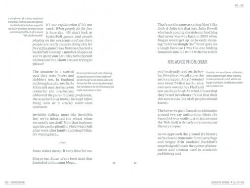
Nodding to the defamiliarization strategies of Russsian formalists like Viktor Shklovskii, I’m that angel takes shape as a stony stone, a cut in the stream – a book. The format concretizes found quotes and other elements; and in every line, a pathology characteristic of our era. Call it inattentionality as method.
Designed by Eric Nylund, this book shores up the bibliographic and citational structures that underpin much of the Internet, as well as literary forms like the confessional and the epistolary that offer precedents for net vernacular. I’m that angel works to build an expanded form of the printed page that draws upon the computer screen’s predecessors: the exegetical framings of The Talmud, for example, and the columnar stutter of Derrida’s Glas. The work attempts, in short, to thread hypertext into a paraliterary matrix.
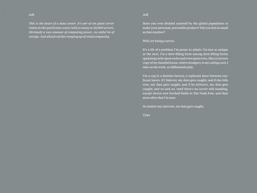
The second part of this project involves readings of the entire book, performed by actor Justin Sayre, at colocation centers worldwide. If the book sustains a material limit that belies the diffuse shape of the cloud, then these sited readings attempt to effect similar concretions by having author, actor and audience occupy a highly securitized, geopolitical and visual field that is rarely made available to the public. The first such performance occurred, over three nights in April 2012, in an all-glass, octagonal conference room, overlooking racks of servers, at Digital Realty in downtown Los Angeles.


Art, Distribution, Eric Nylund, Joseph Portillo, Justin Sayre, Marc Rosenthal, Matthew Corwin, Performance, Roski School of Fine Arts, Tyler Coburn, Viktor Shklovskii


Ginny Cook and Kim Schoen, MATERIAL 3
Softcover, 96 pp. + insert, offset 2/1, 160 x 270 mm
Edition of 500
ISBN 978-0-9801441-2-3
Published by MATERIAL Press
$15.00 ·
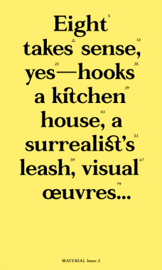
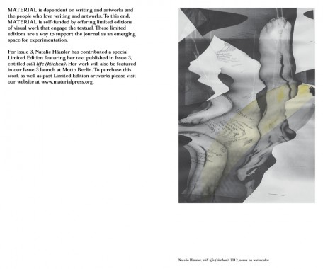
MATERIAL exists as a platform for the artist’s voice. Each issue brings together a different group of artists who write, as well as a new collaboration with a graphic designer. During the production of this third issue, our designer Zak Jensen put forth the idea of concatenation — the act of linking together, or the state of being joined (
It was caused by an improbable concatenation of circumstances) (there was a connection between eating that pickle and having that nightmare)
(the joining of hands around the table).
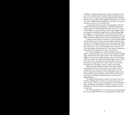
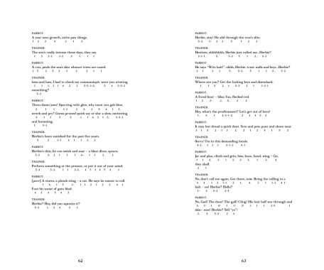
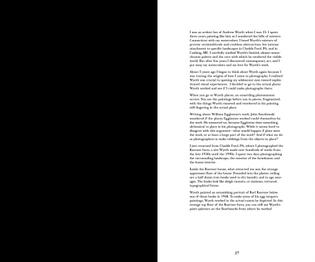
Concatenation (c.1600, from L.L. concatenatus, pp. of concatenare “to link together,” from com- “together”+ catenare, from catena “a chain”) seemed an appropriate word for our editorial method. An unlikely assemblage of texts becomes connected through this process; uncanny linkages emerge. Wyeth appears twice. Performances interact. In this issue: voices that duel, voices that parrot, voices that hypothesize, translate, and meditate, voices that speak simultaneously. As Roland Barthes writes, we have assembled these textual events, as “pleasure in pieces; language in pieces; culture in pieces,” to build upon one another into something new.*
*Roland Barthes, The Pleasure of the Text, trans. Richard Miller (New York: Hill and Wang, 1975), p. 51
CONTRIBUTORS
Farrah Karapetian, Paul Zelevansky, Renee Petropoulous, Nate Harrison, James Welling, Natalie Häusler, Harold Abramowitz, Shana Lutker Stephanie Taylor, Alice Könitz, Frank Chang, and Emily Mast.


Alice Konitz, Andrew Wyeth, Art, Catherine Guiral, Concatenare, Criticism, Daniel Lucas, Design, Distribution, Dorit Cypis, Emily Mast, Farrah Karapetian, Frank Chang, Ginny Cook, Harold Abramowitz, James Welling, John Stezaker, Jonathan Miles, Kim Schoen, MATERIAL Press, Natalie Häusler, Nate Harrison, Olivier Richon, Paul Zelevansky, Quentin Walesch, Renee Petropoulous, Richard Miller, Roland Barthes, Shana Lutker, Stephanie Taylor, Theory, Thomas Lawson, Typecraft Wood & Jones, Typography, Wendy Schoen, Zak Jensen

Enrique Santos, The Mexican Suitcase
Softcover with flaps, 360 pp., offset 4/1, 200 x 240 x 32 mm
English and Spanish
Edition of 2000
ISBN 978-607-7636-29-8
Published by Landucci
$45.00 ·
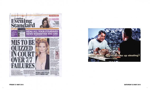
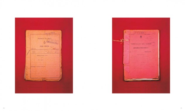
The Mexican Suitcase is the result of more than three years of work by the Mexican-based Argentinian artist, Enrique Santos. This artist book could be, amongst other things, a ‘catalogue’ of an apocryphal exhibition that is not meant to be, one that from its very beginning proposes a reverse path to that already established — first the book, and then? Ever since this basic wink (not to mention that the title itself is an appropriation) Enrique Santo’s work addresses the idea of “robbery”. Using diverse languages and tools (photography, collage, video, sculpture, film, installations) the artist reflects upon the contemporary artistic works in a sociocultural and political environment of violence in which we find ourselves immersed. Robbery as a metaphor of appropriation and “postproduction” — in Bourriaud’s definition of the word — as an element specific of an artistic way of producing, that is loaded with intertextuality, reference, discourse and images that roam our daily lives.
Santos’ work is a way of thinking about how contemporary art is produced, and at the same time it talks about the gaze, the interpretation of he/she who observes, the understanding and production that comes with every look. It reflects upon a single active spectator, who builds a discourse, appropriates all meanings and elaborates on them according to his life story, and his social, cultural and emotional capital. That gaze has a filter through which history is interpreted. It talks about and with the viewer without underestimating his capacity for understanding. From the very beginning, the book presents a relationship of shared complicity, discourse, codes and understandings, but demands a lucid and imaginative perspective.
Retaking film, journalistic, documentary and advertising language, Santos quotes and reinterprets the great thieves of the screen and some real criminals, in order to talk about lies, confusions, myths and misunderstandings, as well as an ever more violent and heartbreaking reality that crawls into our lives through trivialized and shallow images.
— Florencia Magaril


Aaron Smuts, Antonieta Cruz, Art, Deleuze & Guattari, Distribution, Edward Said, Enrique Santos, Film, Florencia Magaril, Gilberto Salinas, Goya, Graham Huggan, Guadalajara, Jalisco, Jean-Luc Goddard, Jorge Luis Borges, Landucci, Marshal McLuhan, Mexico, Pepe Montelongo, Photography, Randy Kennedy, Roland Barthes, Roman Gubern, Sculpture, Tera Patrick, Werner Herzog

Amir Zaki, Eleven Minus One
Softcover, 122 pp., offset 4/4, 9 x 9 inches [26 x 36 inches unfolded]
Edition of 500
ISBN 978-0-26172-2-9
Published by LAXART
$75.00 ·
For this project,
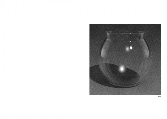
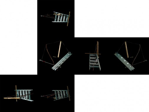
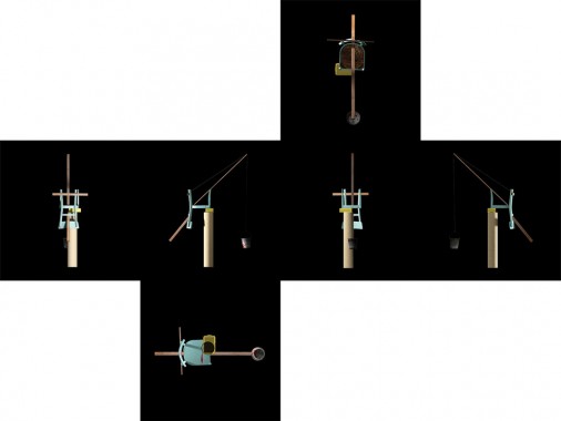
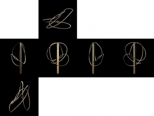
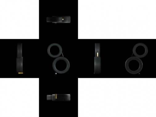
Amir Zaki carefully reconstructed and reinterpreted, in virtual 3D space, several photographs from a series made in the mid-1980’s by Swiss artist duo Peter Fischli and David Weiss. Their photographs depict precariously balancing temporary sculptures that they intentionally constructed in a slap-dash manner. Their photographs of these sculptures were casually shot in their studio using unprofessional lighting and equipment. Through these photographs of temporary sculptural constructs made of household detritus, Fischli and Weiss subvert the idea of sculpture as a heroic manifestation of a unique and masterfully constructed object. Their work privileges the document over the sculpture, which Zaki interprets as an ironic inverse of the ubiquitous professional photographic documentation of the ‘serious’ sculpture found in so many art books and journals. In Zaki’s adaptation of their work, there is a re-inversion at play as he privileges the sculpture again, but only as a 3D virtual non-object in order to destabilize their relationship. This has manifested as a series of short photorealistic animation loops and a foldout book based on the eleven different ways that a cube can be unfolded. Working with this methodology allowed Zaki to further interrogate the conventions and limitations of photography by exploring depictions of ‘real’ space, but without the restraints of actual physics or forces such as gravity. Zaki is interested in the perversion of using Fischli and Weiss photographs of quickly made, throw-away sculptures as a source to create an incredibly laborious photorealistic virtual 3D scene that can be explored from all angles, both through photographic and orthographic projections. In this project Zaki has also fetishized the sculptures by making them virtual, stylized and idealized. He has resurrected these sculptures and placed them in a world where they need not ever ‘fall’ (fail). In the animations Zaki has created, the sculptures simply spin, teeter or gyrate indefinitely. In the photographs Zaki has rendered for the book, the sculptures hover in a perfect orthographic projection space, surrounded by a black void.
The book is a complex foldout design that is quite difficult to describe in text. It is ten double-sided square pages. Each page spread unfolds into unique configurations of six squares that represent all sides of a cube. The images on each unfolded page spread depict 3D digital recreations of photographs from the series Equilibres by Swiss artist duo Peter Fischli and David Weiss. When fully unfolded, the book opens up to approximately 27 x 36 inches. It is an interactive object, and can be folded and unfolded in multiple ways, creating grids, cubes, and unfolded boxes, each creating a unique experience and juxtaposition of images. It is important to recognize the book in terms of a limited edition or a multiple. It is also more of an object with sculptural qualities and a tactile nature than a ‘book’ in the traditional sense.


Amir Zaki, Art, David Weiss, Distribution, Eighth Veil, Greenblatt-Wexler, LAXART, Peter Fischli, Photography, Sculpture


Doniella Davy, Z-Girl and the Snake Charmer
Edited and Designed by Daniel Wagner
Softcover, 44 pp. with inserts, mimeograph 2/2, 5.5 x 8.5 inches
Edition of 100, numbered
Published by The Kingsboro Press
$11.00 ·
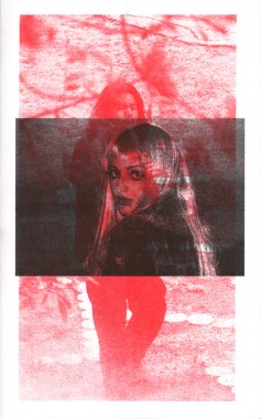
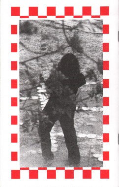
A semi-follow-up to Hippie Photos and Surfer Man, Los Angeles-based photographer Doniella Davy’s imprint Z-Girl and the Snake Charmer returns to the voyeuristic photo-based narrative format to weave a two part story of a woman in trouble and the mysterious “snake charmer”.
Art, Culture, Daniel Wagner, Distribution, Doniella Davy, Photography, The Kingsboro Press
